To keep it simple, user experience describes how users perceive a website, what kind of emotions they have when visiting a website, and whether or not they are motivated enough to return. This subjective experience is in a large part based on the visual appearance of a website.
Of course web design is its own field of expertise and one could claim that only experienced designers are capable of designing a good website and therefore provide the basis for high user experiences. There are some basic principles, though, that can help not only professionals to design an appealing website – the so called “Gestalt Laws”.

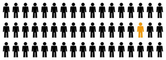
Figure 1 – Law of Similarity (Source)
Gestalt Laws
Gestalt Laws are simple principles or suggestions of how different elements can be perceived when combining them in a certain way/order. Gestalt Laws can help to create for example structure and a sense of togetherness on a website, they give suggestions on how to draw attention to elements that are important or how to create an impression of balance and stability.
Gestalt Laws find their origin in psychology and were first introduced in the twentieth century. Gestalt is a German term and can be translated with “shape” or “form”. Gestalt laws are basically regularities about how elements are perceived and organized into an unified whole.
The aim of this article is to give an overview of common Gestalt Laws, explain their possible effects, and present examples of how exactly different laws work in the context of a website. Gestalt Laws can seem quite simple, but their effects can have a big impact on a website’s user experience. The following Gestalt Laws will be addressed in this article: the Law of Proximity, the Law of Similarity, the Law of Closure, the Law of Good Continuation, the Law of Figure and Ground, the Law of Simplicity, the Law of Symmetry, and last but not least the Law of Experience.
Law of Proximity
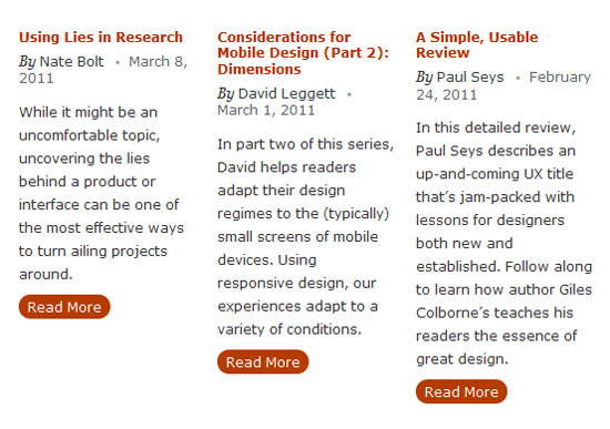
The Law of Proximity indicates that elements that are near to each other tend to be perceived as a single unit. This can be very helpful for e.g. if you want to display two categories of elements on a web page of which each has more than one piece of content. You can easily group the pieces of one category by placing them closer to each other than the distance between the two categories. Figure 2 shows how this Gestalt Law is used on the UX Booth website to group elements that belong together. Different distances between the elements give us the impression of three columns, of which each contains one teaser per article.

Figure 2 – Law of Proximity (Source)
Law of Similarity
The Law of Similarity claims that elements that appear similar are perceived as one unit. So elements that have for e.g. the same color, shape, or other common characteristics, are perceived to be belonging together. This phenomenon can be very useful to group elements together that belong to one category. In Figure 3 you can see how CNN uses this Gestalt Law to present different topics within one news category as a unit.

Figure 3 – Law of Similarity (Source)
Law of Closure
The Law of Closure explains why elements are recognized even if they are incomplete or nonexistent. This is due to our previous experiences and prior knowledge about possible shapes and figures, thus mentally we can supplement missing parts of an element. Figure 4 shows how we used this law for our homepage usabilla.com. There is a white background with round corners that runs out towards the bottom of the page. Still, we do not perceive elements at the bottom of the page as falling apart, but we can imagine the content area continues.

Figure 4 – Law of Closure (Source)
Law of Good Continuation
The Law of Good Continuation can be applied to both the design aspect as well as the content aspect of elements. Eyes can easily and naturally follow elements that are arranged along a continuous line, those elements are therefore perceived as a unit. Further, elements that follow each other either logically or temporal, are perceived as unit as well. Figure 5 shows how Concept7 use the Law of Good Continuation on their website. Concept7 use a small arrow (at the bottom right hand side) to direct their users sight.

Figure 5 – Law of Good Continuation (Source)
Law of Figure and Ground
The Law of Figure and Ground describes how we rather perceive a figure than the background which flows around it. There are several factors that might contribute to this phenomenon. First of all, a defined figure has a more salient appearance whereas a background does not stand out. Furthermore, if one object is placed on top of another, in this case, a figure is placed on a background, the impression of depth emerges and therefore the figure actually appears to lie on top of the background.
Another reason that leads to this figure-ground assumption is that in case there is a border line between both objects, it is more likely interpreted to belong to the figure rather than the background. Figure 6 shows how we placed several logos on a colored background. Only the logos are perceived, not the shapes that result from placing the logo on the colored background.

Figure 6 – Law of Figure and Ground (Source)
Law of Simplicity
The Law of Simplicity indicates that elements are always perceived in the most easiest way possible. Simplicity of the whole emphasizes the importance of striking features. This can be used as an advantage on a website. Keep it simple and the focus on what really matters. We tried to keep our website as simple and clean as possible, so we can focus on what we really want to communicate. Figure 7 shows an extract from one of our pages.

Figure 7 – Law of Simplicity (Source)
Law of Symmetry
This law comprises the fact the we prefer symmetric appearances over asymmetric ones. Symmetric objects or arrangements are associated with positive aspects such as stability, consistency and structure. Asymmetric arrangements on the other hand give a rather negative impression, like something is wrong, missing, or out of balance.
Of course a website can never be completely symmetric, which is not at all the idea, but it is possible to pay attention to the perceived symmetry. So symmetry does not necessarily have to be created by content, but also by aesthetic elements such as color or design. For example, the head of the BBC website uses an abstract picture of a globe in the background to create a harmonious and balanced appearance.

Figure 8 – Law of Symmetry (Source)
Law of Experience
Another Gestalt Law that can be quite useful is the Law of Experience. It explains that we can expect others to use their prior knowledge in order to understand certain elements. A common example is related to grammar and spelling. For example sometimes we overlook a spelling mistake because we have memorized a word as a whole and do not look at every letter within the word specifically.
Outlook
There is a whole list of different Gestalt Laws, even more than we discussed in this article. Some Gestalt Laws are unique, others overlap each other, some are more useful for designing a website, others less, some might be easy to apply, others more complicated. But in general, we can conclude that Gestalt Laws do give some good advice, such as how to group elements that belong together, how to point the attention to elements that are important, or how to create an impression of balance and stability.
When designing or optimizing a website you should keep the Gestalt Laws in mind. Start with a solid and consistent design and create the base for a successful website. After working with Gestalt Laws for a while, you will see that they become internalized and that you will start to apply them naturally.
Also, you can specifically test whether or not you applied certain Gestalt Laws successfully. Do you want to find out if your users perceive certain content as a single unit? Or if they think that your website’s overall design appears to be harmonically or chaotic? Or if they actually focus their attention on the elements you want them to focus on? You can easily test your design and find answers to these questions – even in the conceptual stage.


No comments:
Post a Comment